G
Guest
Guest
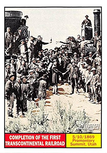
...not only that but showing the dirty ancient engines (which are ugly) on a site designed to advertise PASSENGER service doesn't juice the appetite to ride (maybe to you guys, yeah, but not the average Jane/Joe). What year were they designed?To be fair, only one aspect of it is badly done. The composition is great, and it's a composition that suits itself very well for cropping into a banner format. It's not the photographer's fault.A badly done one at that.Isn't it interesting how much information a discussion about one picture can generate?
It's just that the edited version of the photo on the website terribly grainy, probably because they super-compressed the image down to 52 KB for the website. I suspect the original is much sharper, and that they could replace that version with a sharper image with a larger filesize if they wished, but that they chose to compress it as far as possible to minimize page-load times. It's a trade-off webmasters have to make, and this webmaster went overboard on the compression, in my opinion! (It's possible the original is actually a grainy slide, but I doubt it.)


