I was looking at https://www.amtrak.com/guestrewards/member-benefits.html for an explanation of the tier levels and various other things. I don't understand this chart at all. It looks like it was improperly flipped before getting into the website. For example, it shows several rows of check marks that don't line up with any row headers and the Select Plus status has no check marks at all. How does it look on other computers? Is it just me or...? And if it did get flipped, who/how do we contact for unflipping it or whatever?
You are using an out of date browser. It may not display this or other websites correctly.
You should upgrade or use an alternative browser.
You should upgrade or use an alternative browser.
Confused by guest rewards tier level explanation
- Thread starter Barb Stout
- Start date

Help Support Amtrak Unlimited Discussion Forum:
This site may earn a commission from merchant affiliate
links, including eBay, Amazon, and others.
It looks correct on my desktop.
- Joined
- Feb 18, 2003
- Messages
- 8,526
Thanks! Now that's more like it. I use Chrome on a Mac, so I wouldn't think it would be a problem, but my Mac isn't the latest, so that is probably the issue.Looks OK here - Windows 10, ChromeView attachment 13703
MacOs Mojave 10.14.4Thanks! Now that's more like it. I use Chrome on a Mac, so I wouldn't think it would be a problem, but my Mac isn't the latest, so that is probably the issue.

$21.75
Scenes Along The Oversea Railroad - Key West Extension Florida - 1919 Curt Teich Souvenir Postcard Folder #1039
grinvideoproductions

$4.00
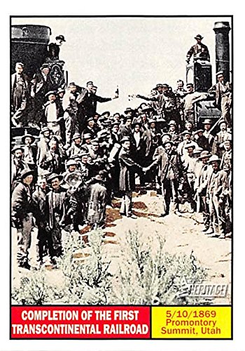
Completion of the First Transcontinental Railroad trading card (Promontory Summit Utah, 5/10/1869) 2009 Topps Heritage #113
Autograph Warehouse (AW Authentic)

$20.99
$27.98
Walthers Trainline HO Scale Model Flatcar with Logging Crane - Alaska Railroad 17104, Blue
Amazon.com
Latest posts
-
-
-
-
-
-
North East Corridor (NEC) speeds, new stations and state of repair
- Latest: JuniusLivonius
-


