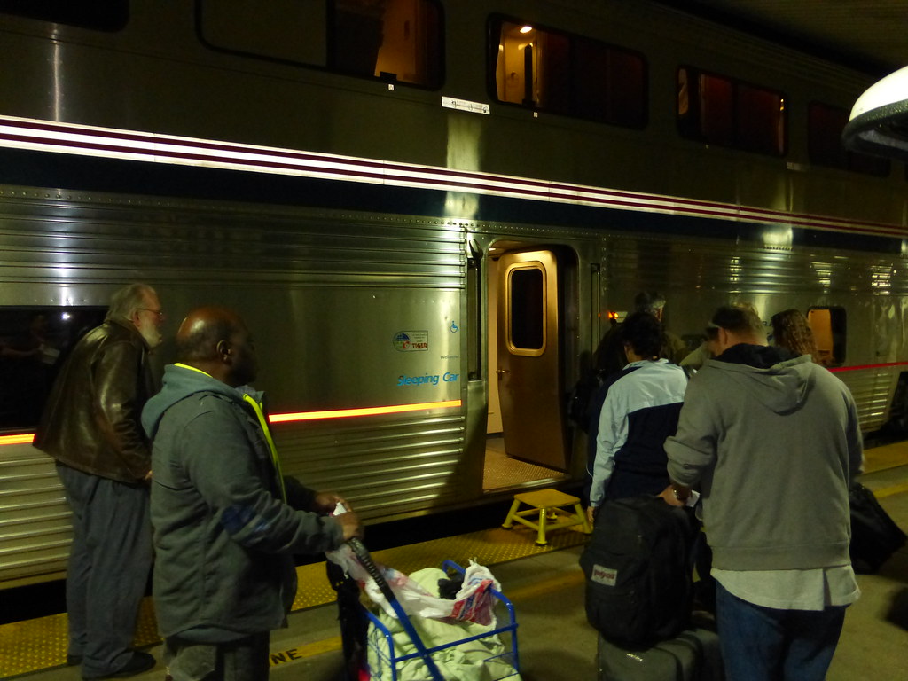
They moved it near the door. Much smaller fonts.
P1000033 by
seat38a, on Flickr
I dislike this "names in small font down by the door" thing immensely. This photo is a good reason why that's such a BAD idea. In busy stations, people are walking back and forth in front of the doors constantly, & block your view of the car name.
I think of myself as an "average" LD train traveler. I can recognize a dining car & a lounge car pretty easily, but I can't always tell the difference between a coach car & a sleeper quickly - especially if I'm walking through a crowded station and I'm busy trying not to run into people.
This rather bland paint scheme may be more unified across the fleet, but it doesn't make it easy for non-railfans to identify the car they're looking for. Also, I think Amtrak is missing a big advertising opportunity - how many Americans see a Superliner go by on a train track, and have no idea what it is? Why not use that opportunity to promote Amtrak travel?
I can see the argument for larger letters saying what the car is for advertisements sake. However stating "Superliner" in big letters down the side isn't really something needing advertised. Superliner is a type of car, it's not really any different (in terms of new passenger comfort) then a Horizon or an Amfleet. If you're going to put "Superliner" in big letters down the side, why not also put "Horizon" in big letters down the side of those cars?
As for the station boarding, you're rarely boarding completely unguided by Amtrak. In most cases there is an announcement telling you where to go to board, as well as someone by the door who is going to look at your ticket and tell you where to go, regardless if you read the sign next to the door. In most cases "Coach" doesn't really delineate where you will be boarding; usually you board based off destination, and having "Coach" in big letters on the side isn't going to help you figure out where to go. Also, your not really ever going to be that far away from the train when looking where to board, so small letters are quite adequate, a platform is only a few meters wide. For sleeping cars, you board based off train car number, which really isn't publicized on the exterior, and never really was.
If you wanted to implement a signage system to assist in boarding, for long distance trains (superliners) put an LED sign on the outside stating that car's destination. For corridor trains, a sign at each station, showing the mockup of the train and what cars go wher (much like they do in Europe) would work.
I agree with you about the Superliner part - having "Superliner" on the side of the train was silly, and imparted no useful information to passengers. I'd just like to see them replace the large "Superliner" wording with "Sleeping Car" or "Coach Car" (or "Chair Car").
I often board in Chicago, & from what I've seen many of the urban stations are similar. You go from a relatively quiet, well lit lounge/station to a dark cavern filled with engine noise, noxious diesel fumes, passengers milling about everywhere, and redcaps who constantly plow through crowds and honk incessantly. Basically, it's one of the circles of hell. Anything they can do to speed things up, even by a few seconds, would help tremendously.
I never have the consists memorized. At best, I can remember that my car is in the front, middle, or rear of the train. Most people don't even know what a "consist" is, and have no idea which car is theirs. As they meander along the train, asking everyone along the way which car is theirs, I just think it would be helpful to give people information that they can remember & will be useful.
For example, if "Sleeper Car" is written in huge blue letters, and "Coach Car" is written in huge red letters, it would be really easy to tell people "Your car is the middle red one" or "the first blue one". It would really cut down on the crowds and confusion.


