IMHO, Amtrak's Marketing Dept/Operations Dept got snookered by the graphics design group. While many people like the "look and feel" of the current paint scheme. ("sleek, modern, understated.....yada yada, yada.....)
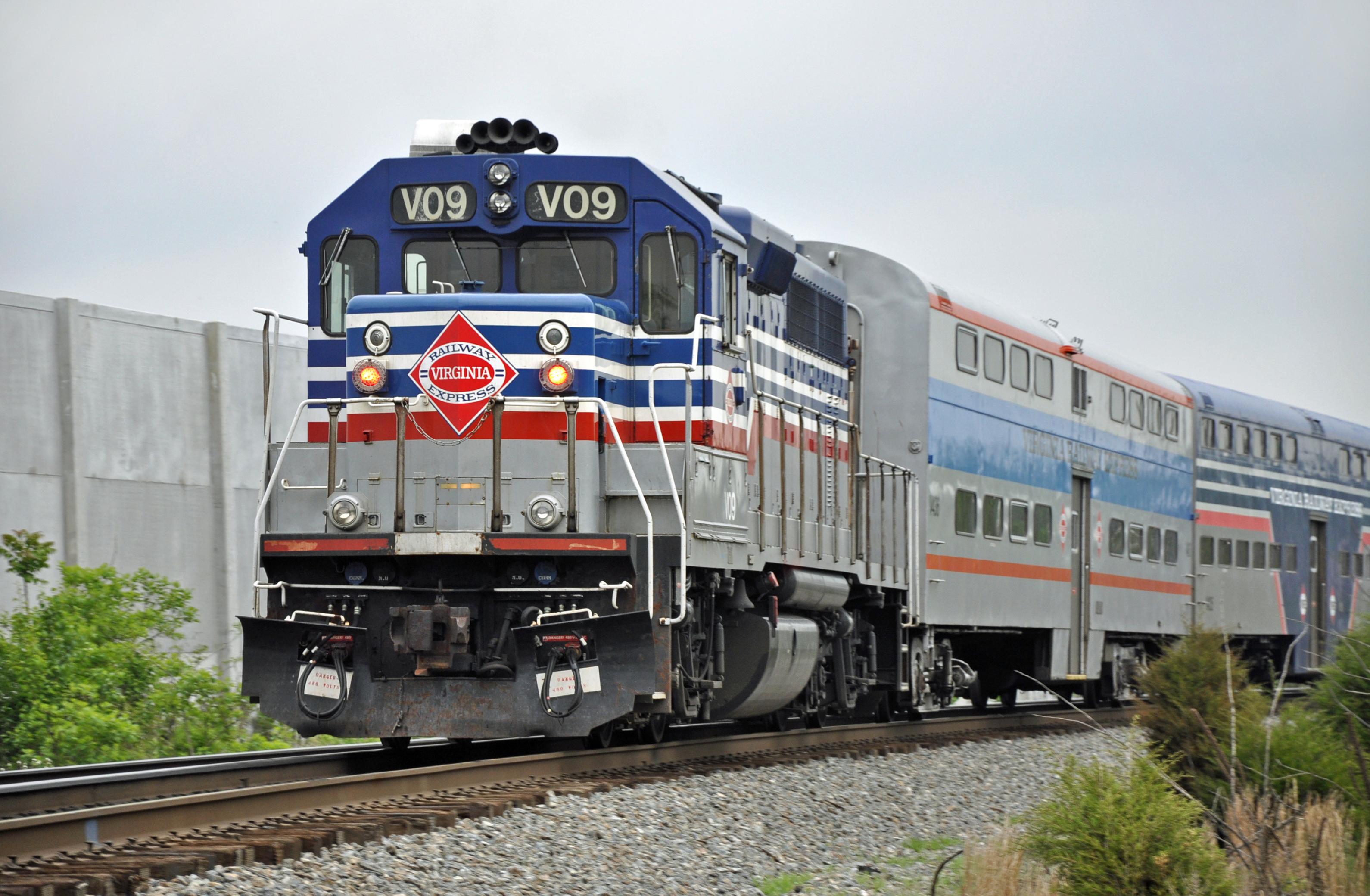
The marketing group needs to WAKE UP, and realize that their trains are in essence, ROLLING BILLBOARDS, on which they could ADVERTISE, to the hundreds of thousands of potential riders, mostly in cars, that watch a train roll by at some point, every day, in almost every state.
While I don't "like" the visual aspect of "BIG and GAUDY", hey, it's advertising, and it's FREE. Were I in charge of marketing, the outside of every Amtrak passenger car would make every railfan, historian, artist, or graphics person cringe.
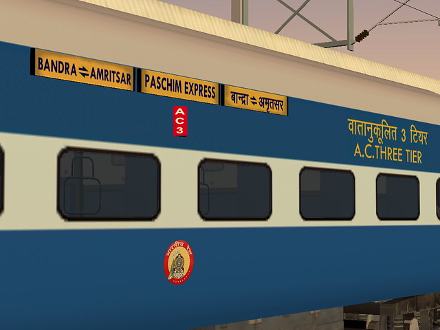
NO shame! The designs should SCREAM OUT LOUD, "Ride the train", "Dinner on Board", "Sleeping Car", "Lounge Car", "Next Time Take The Train", etc., etc., etc.
It's about putting BUTTS IN SEATS (or BEDS), and Amtrak should do everything possible to maximize these rolling billboards.


